Design details
A look inside the ENRJI packaging system: the drawings, the colours, the formats and the small decisions that make a 4 g pack readable from across a shop counter.
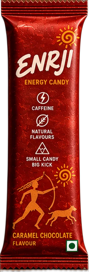
Loud on a tiny canvas
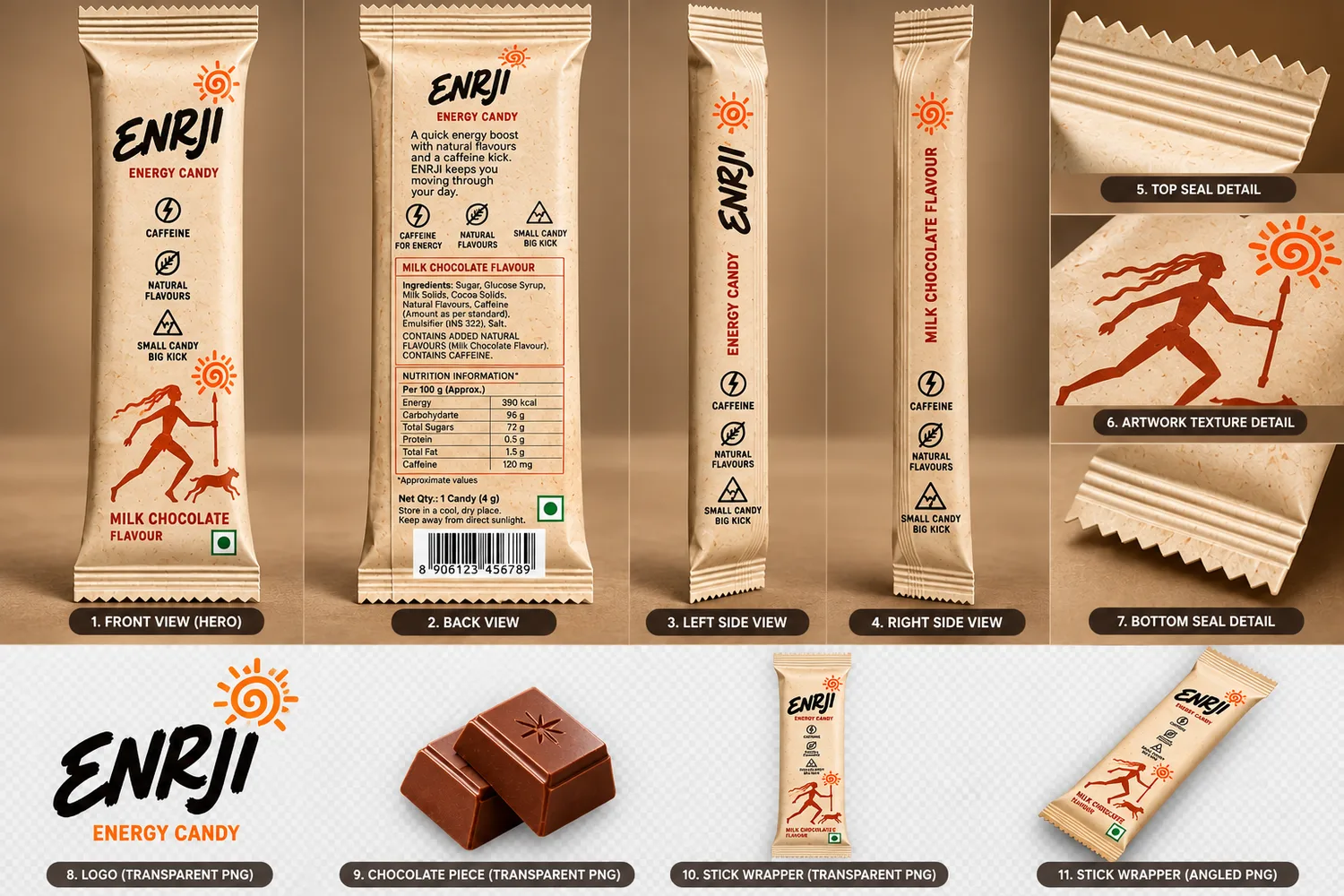
A stick pack is about the size of a finger. It has to say brand, flavour, "contains caffeine" and veg status, and still look like something you want to tear open.
The answer was a strict hierarchy: the hand-lettered ENRJI wordmark first, a single illustration second, and flavour name plus regulatory marks grouped at the bottom where the eye lands last.
Hunters, dogs & the sun
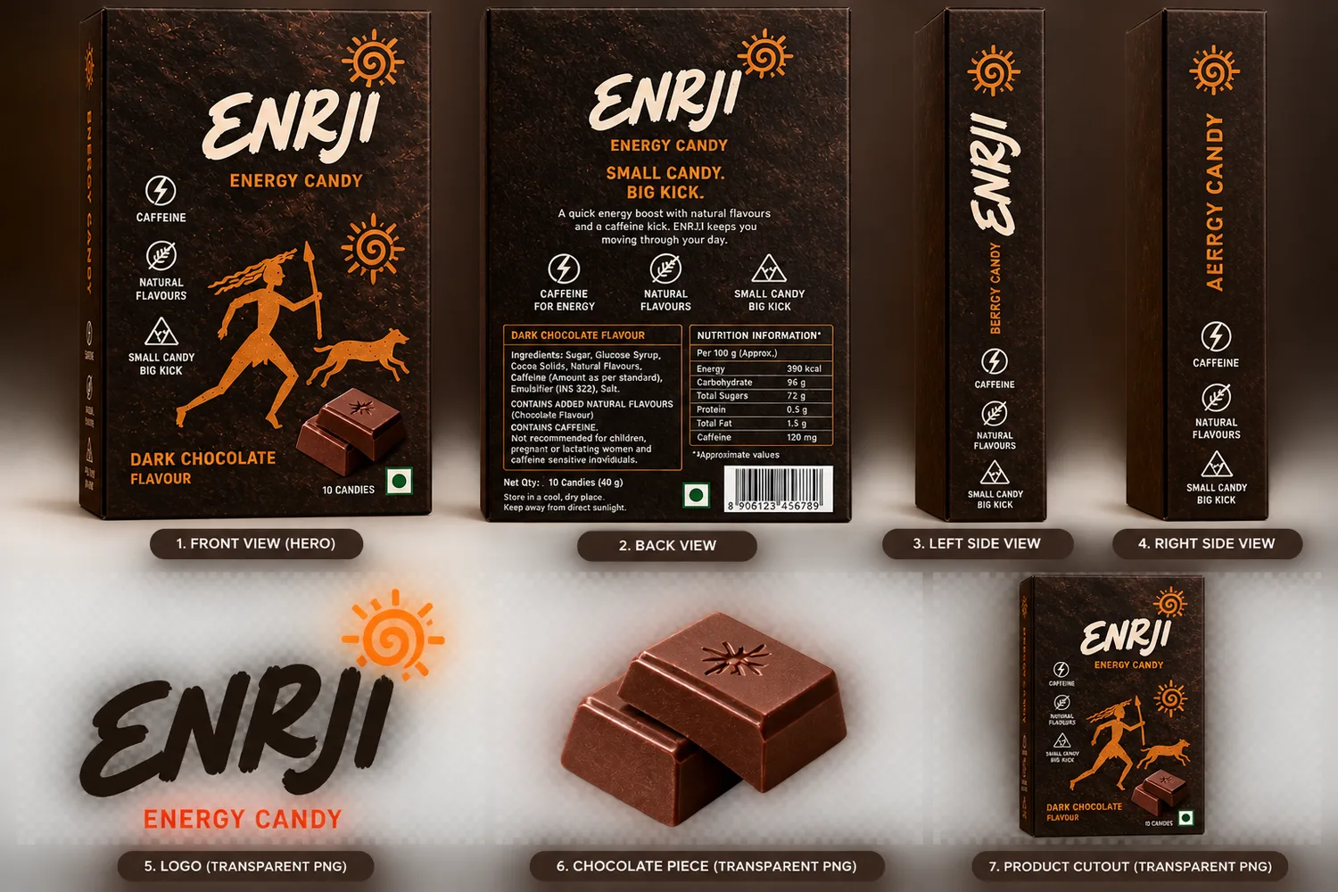
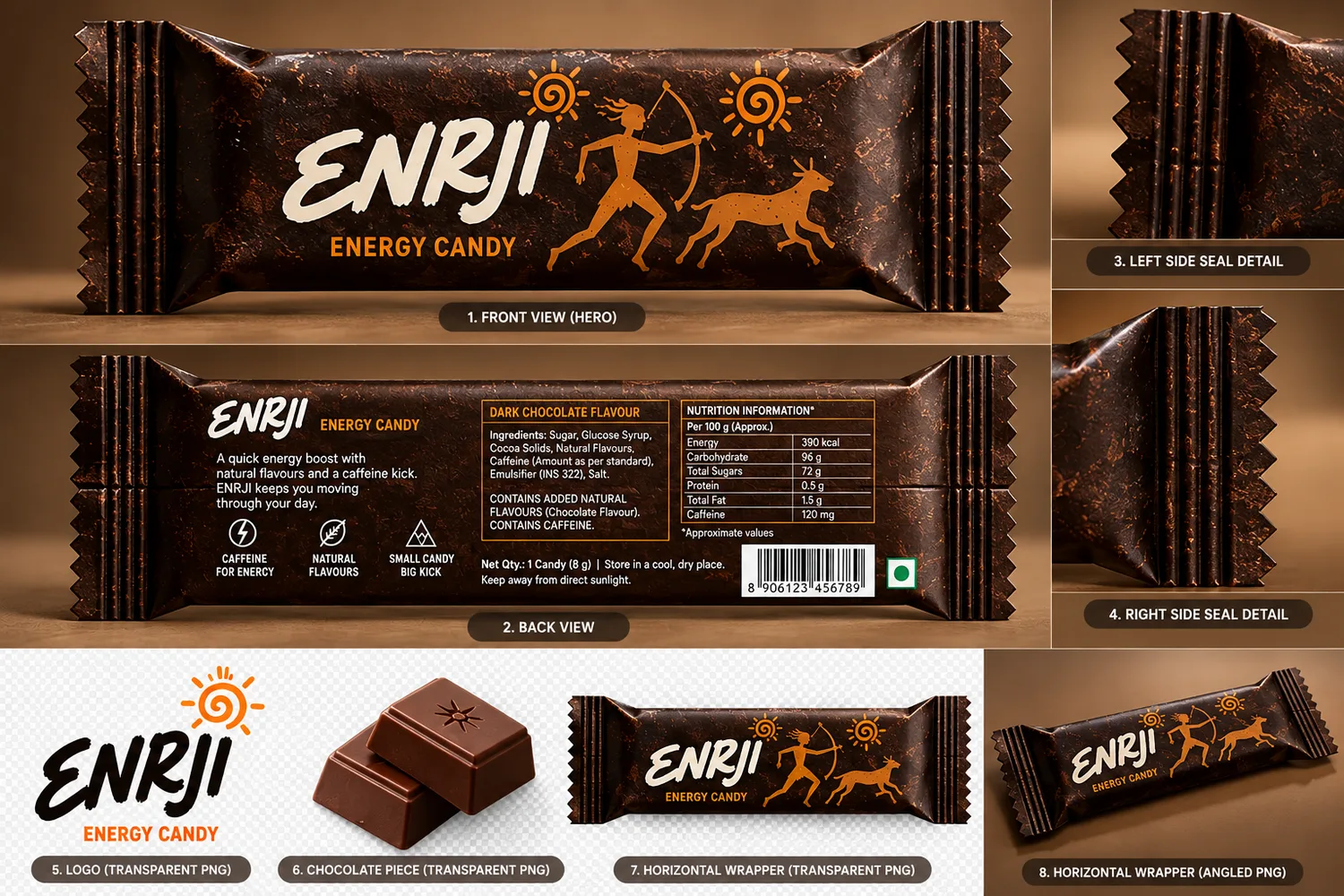
The packs borrow the language of ancient rock paintings: stick-figure hunters with bows and spears, running dogs and a spiral sun. Energy, movement and the chase, drawn in a style that is thousands of years old.
The figures are flat, single-colour and orange, so they print cleanly on foil and stay legible at small sizes. The sun spiral doubles as a brand mark: it appears beside the wordmark and alone on the box flaps and seals.
One look, three flavours
Dark
Near-black with a cocoa texture. Reads as intense and serious.
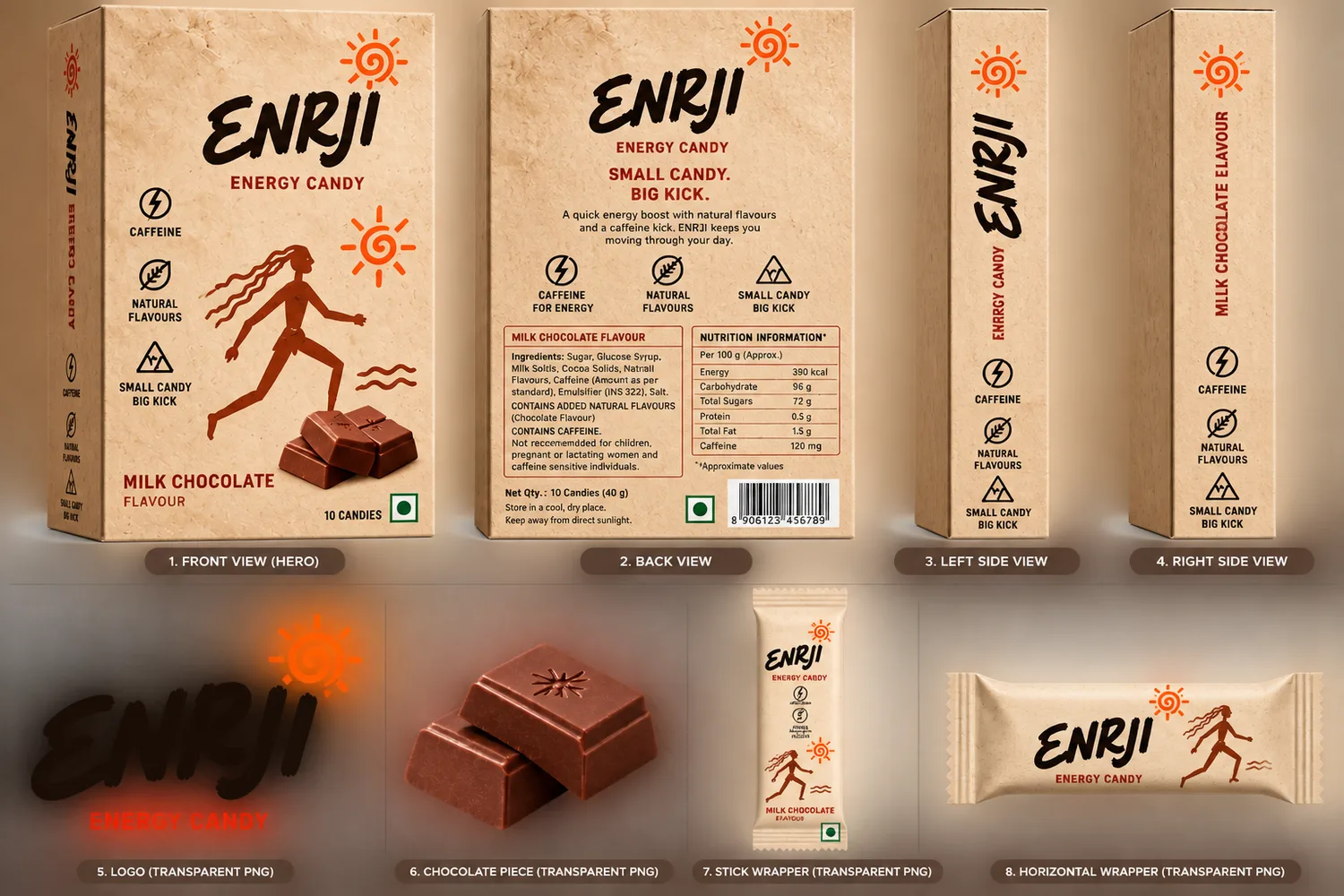
Milk
Warm cream base. Soft, approachable and clearly lighter.
Caramel
Deep red. Stands out on a shelf and signals the sweetest of the three.
Across all three the illustration, wordmark and layout stay identical, so a shopper recognises ENRJI first and then picks a colour.
From sketch to shelf
Research
Studied candy and energy shelves in Indian stores: what is visible from 1.5 m, what is lost in the glare of foil.
Wordmark
Hand-drawn brush lettering for ENRJI, drawn tall and narrow so it fills a stick pack vertically.
Illustration system
Rock-art figures and the sun spiral, built as reusable pieces that rearrange for stick, box and horizontal wrapper.
Dielines and boards
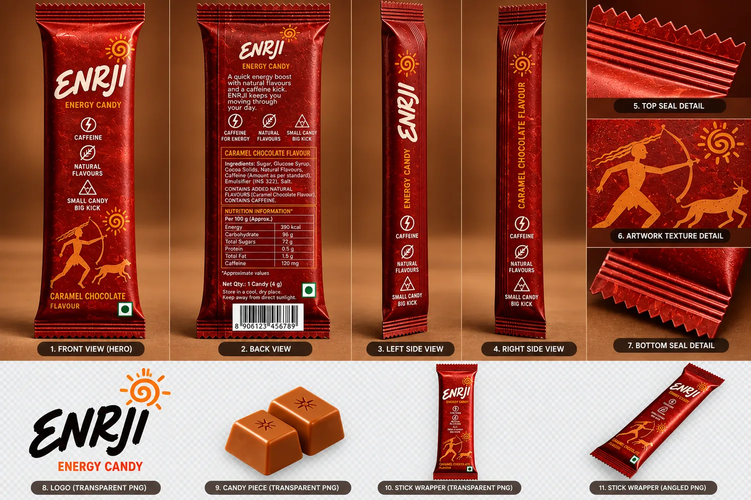
Front, back, side and seal views for every pack, with ingredients, nutrition per 100 g and FSSAI-style marks placed on the back panel.
3D and web
The packs were modelled in 3D for the scroll animation on the home page and the brown-and-white website theme.