Why ENRJI is brown and cream
Choosing a palette that says chocolate, energy and warmth without shouting like a typical energy brand.
01Breaking the category code
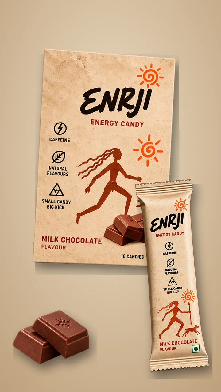
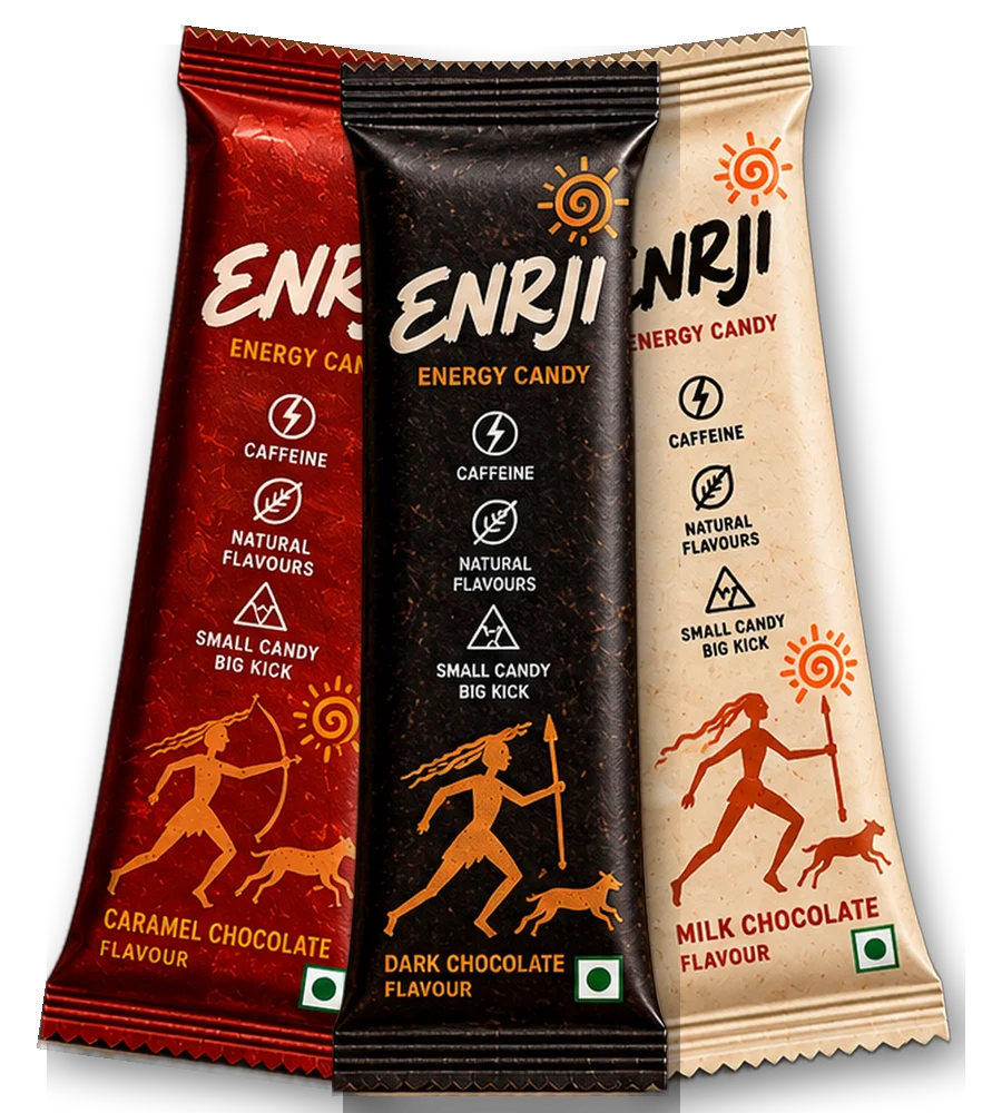
Energy products usually look the same: neon, black, silver, lightning bolts. That signals "energy", but it also signals "drink" and "extreme". ENRJI is a chocolate candy, so the palette started from cocoa instead.
02The palette
Chocolate (#32180F) and Roast (#482317) do the heavy lifting as backgrounds. Cream (#F5F2E9) and Tan (#E9D5B8) keep things light and readable. Caramel (#B86C35) is the accent for buttons and highlights, and Pack red (#A91F18) belongs to the Caramel flavour.
03Why it works
- Appetite: warm browns read as food, specifically chocolate and coffee.
- Contrast: cream on chocolate is easy to read, which matters for warnings and ingredients.
- Distinctiveness: on a shelf full of neon cans, a warm brown pack stands out.
04Where the energy comes from
The energy is carried by the orange illustrations and the sun spiral rather than by the background colour. That keeps the brand calm overall with sparks of movement where the eye lands.
Copy any colour from the Brand package.
Fin.

Designer of ENRJI's product, packaging and website. Writes about caffeine, snacking and design. This article is general information, not medical advice; see the disclaimer.
Keep reading
Designing the ENRJI stick pack
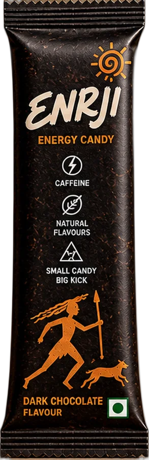
Rock-art hunters, a spiral sun and a finger-sized canvas: the story behind the packaging.
8 packaging lessons for small snack brands
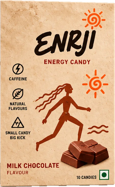
What we learned designing for packs smaller than a phone, for anyone launching a snack in India.
Can a ₹2 candy take on the energy drink?
Energy candy went from a niche idea to a sold-out launch in four minutes. A breakdown of why the format works, what it costs per milligram of caffeine, and what could stop it.