
Designing the ENRJI stick pack
Rock-art hunters, a spiral sun and a finger-sized canvas: the story behind the packaging.
01The brief
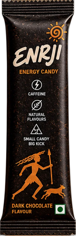
A stick pack is one of the smallest canvases in packaging. ENRJI's needed to carry a brand name, a flavour, a vegetarian mark, a caffeine warning and enough personality that someone would pick it out of a jar on a counter. All of that on a strip roughly the width of a finger.
02The idea: the oldest energy story
Energy is about movement, and some of the oldest pictures of movement are rock paintings: hunters with bows, running animals, the sun overhead. India has some of the most famous examples at Bhimbetka in Madhya Pradesh. That visual language became the heart of ENRJI's packs: orange stick-figure hunters and dogs mid-chase, under a spiral sun.
03Why it works at small sizes
- Flat shapes print cleanly on metallised film, without fine detail getting lost.
- Single colour keeps the figures legible against dark and light flavour backgrounds.
- Silhouettes read from a distance, so the pack is recognisable before the text is.
04The wordmark
ENRJI's name is hand-lettered with a brush, drawn tall and narrow so it can run vertically up a stick pack. The rough edges echo the rock-art figures, so the logo and illustration feel like one piece.
05One system, many packs
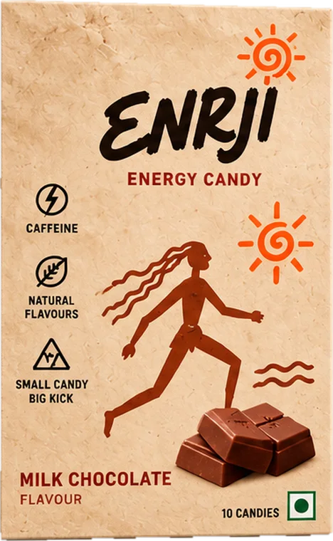
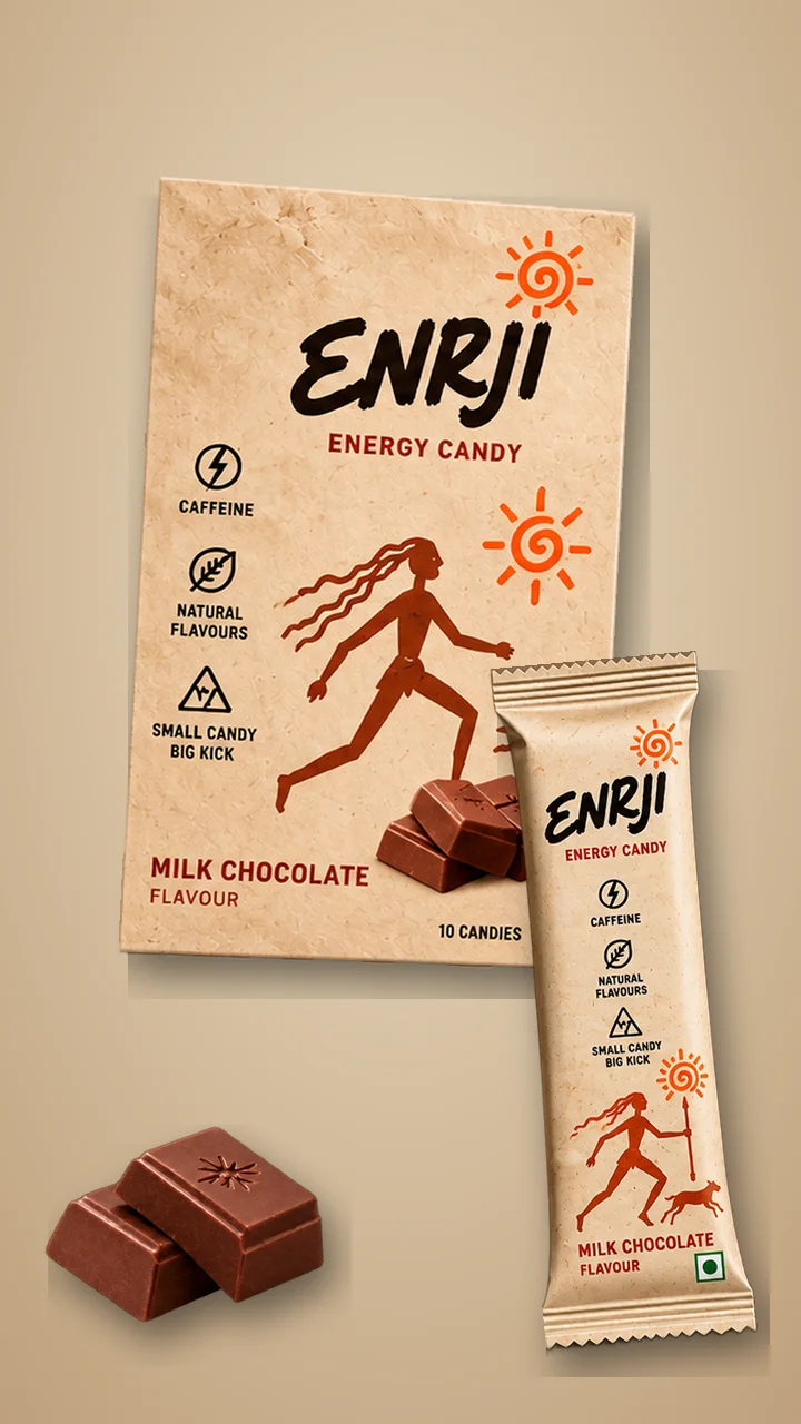
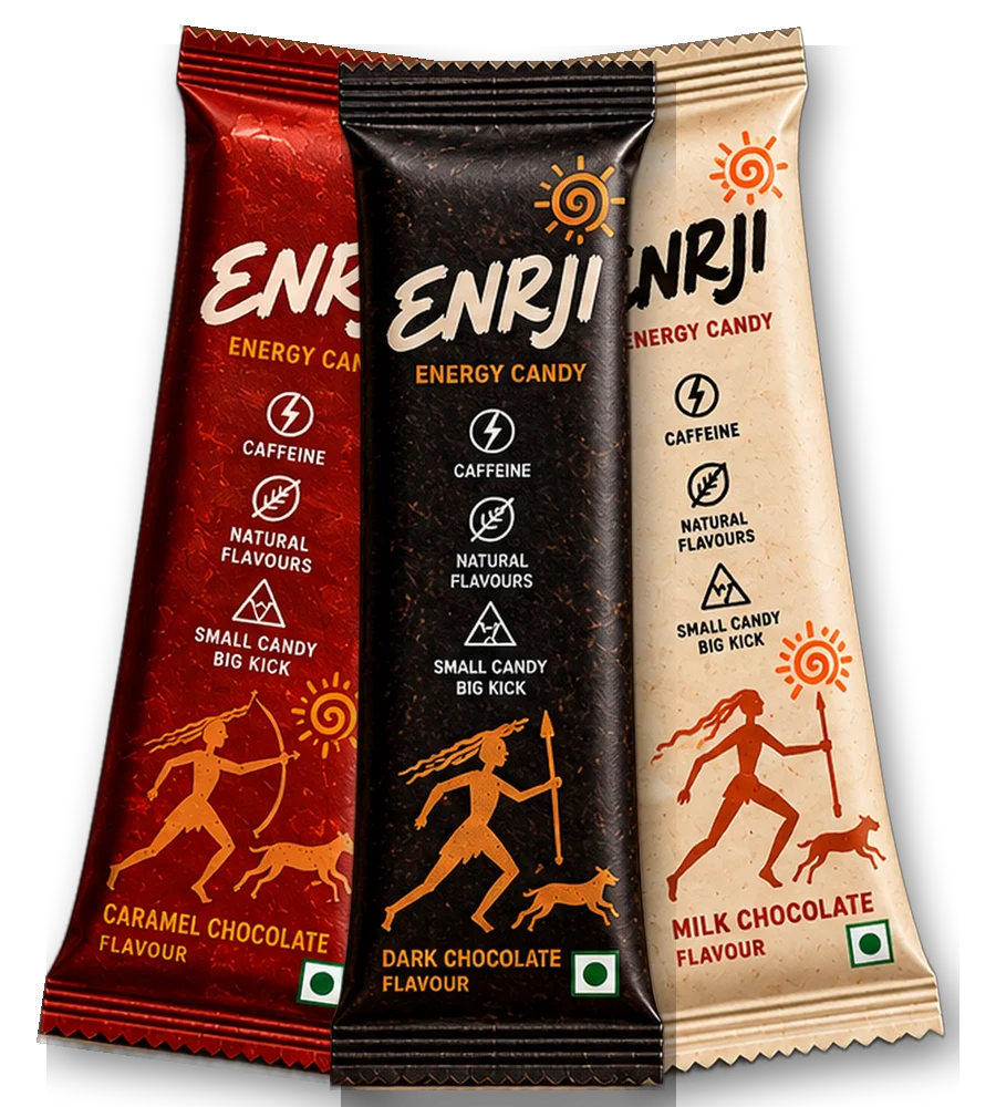
The same parts rearrange across the 4 g stick, the box of 10 and the 8 g horizontal wrapper. Only the background colour changes by flavour: near-black for Dark, cream for Milk, red for Caramel. See the full breakdown in Design details and the colours in the Brand package.
Fin.

Designer of ENRJI's product, packaging and website. Writes about caffeine, snacking and design. This article is general information, not medical advice; see the disclaimer.
Keep reading
8 packaging lessons for small snack brands
What we learned designing for packs smaller than a phone, for anyone launching a snack in India.
Why ENRJI is brown and cream
Choosing a palette that says chocolate, energy and warmth without shouting like a typical energy brand.
Can a ₹2 candy take on the energy drink?
Energy candy went from a niche idea to a sold-out launch in four minutes. A breakdown of why the format works, what it costs per milligram of caffeine, and what could stop it.